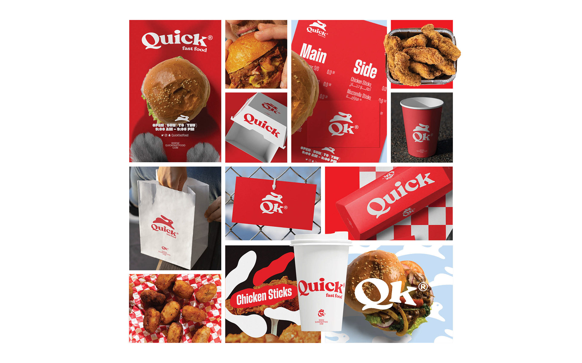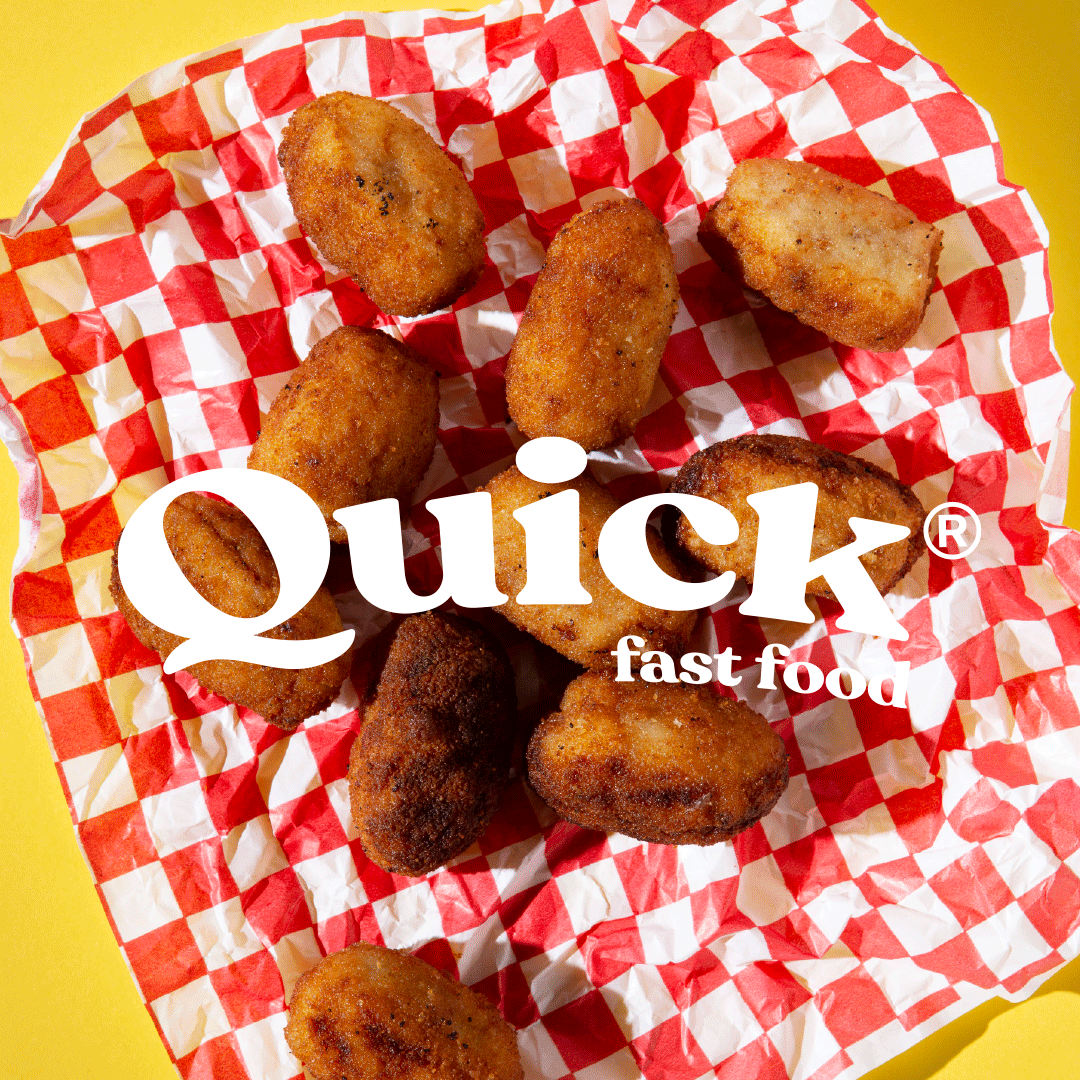
Quick fast food
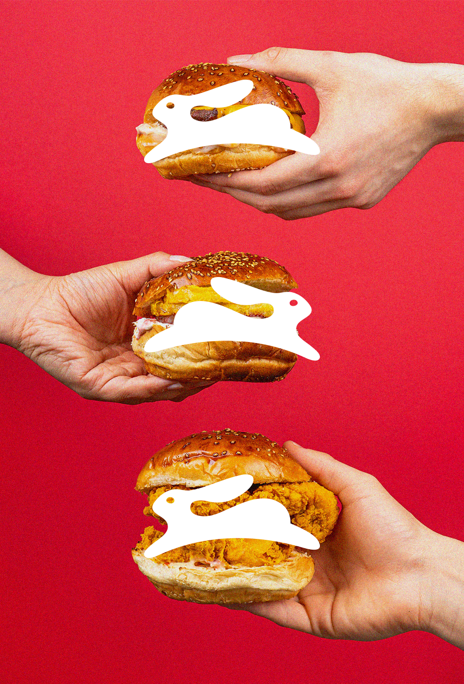
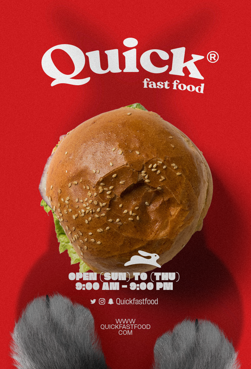
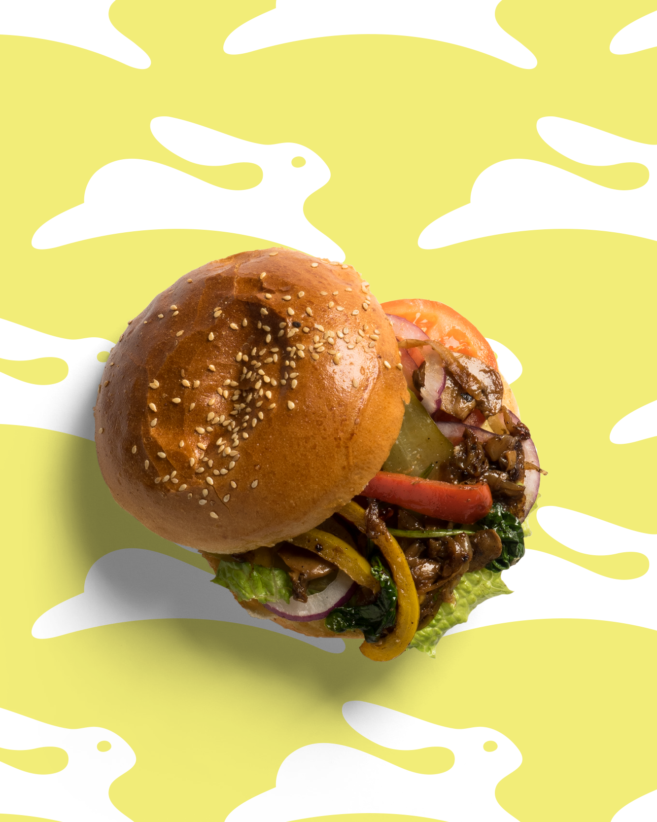
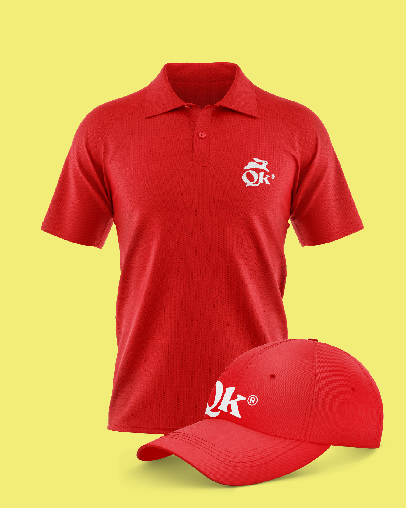
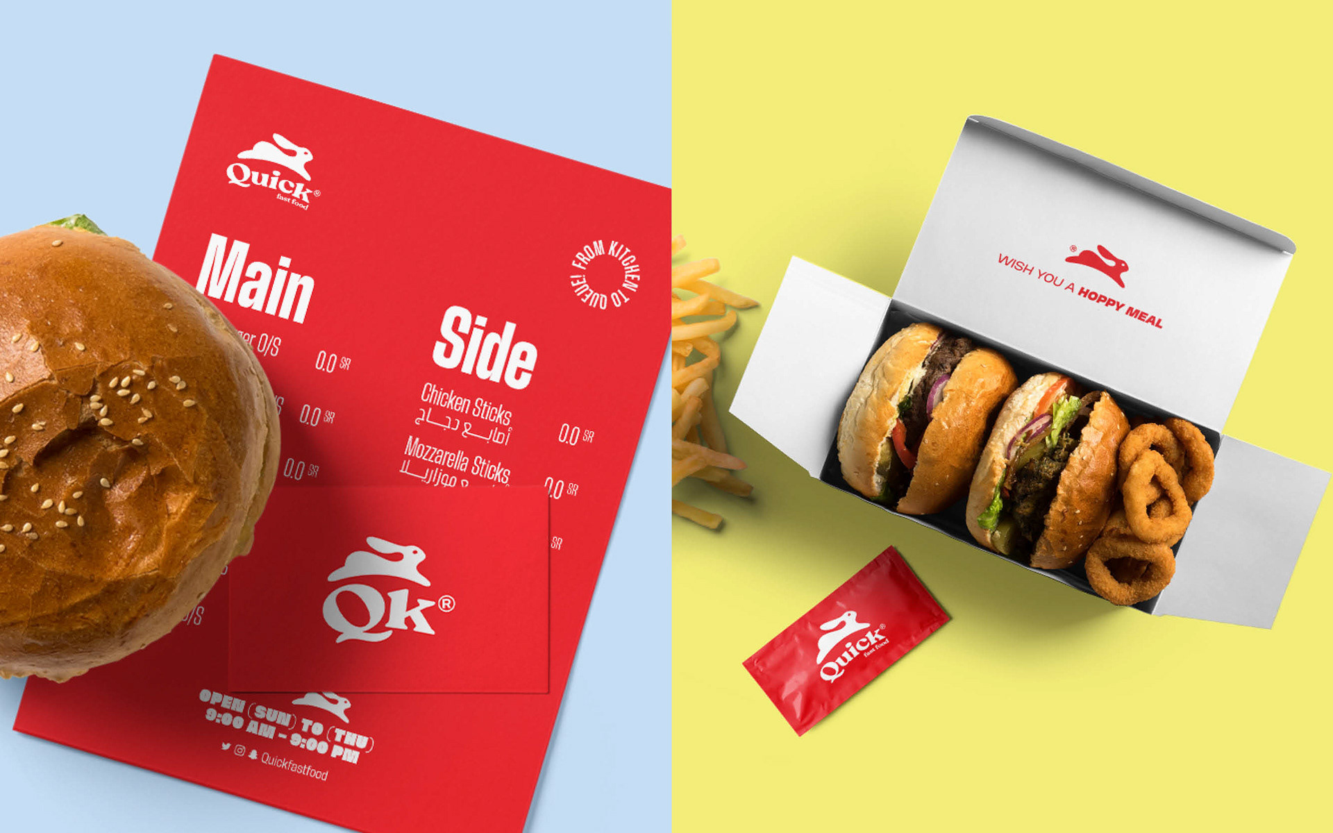
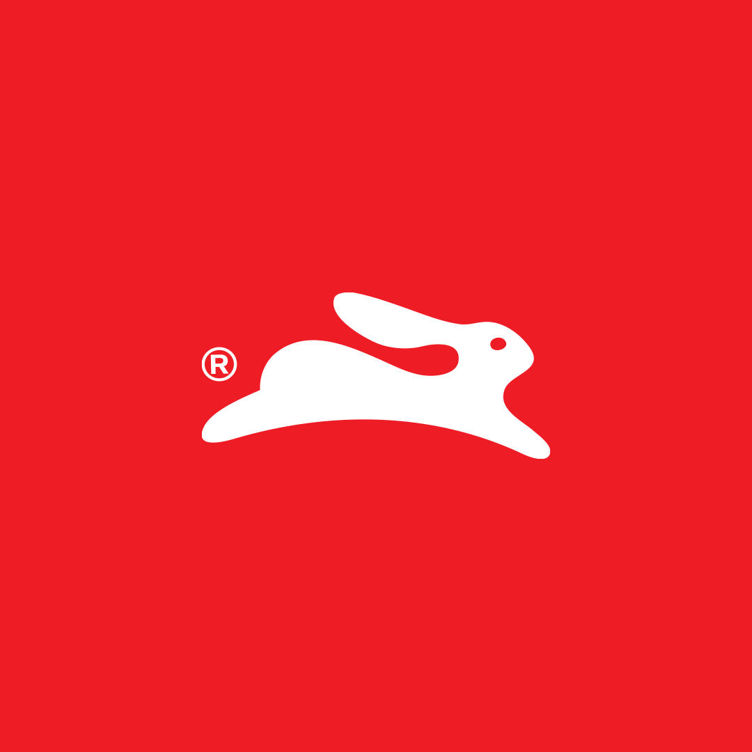
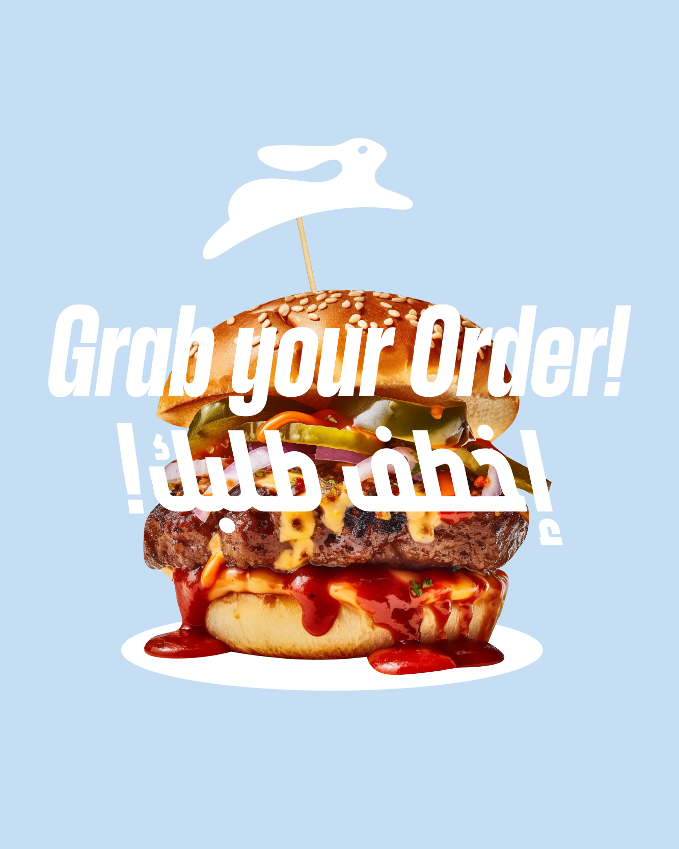
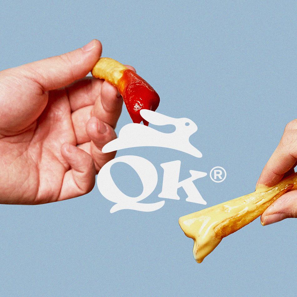
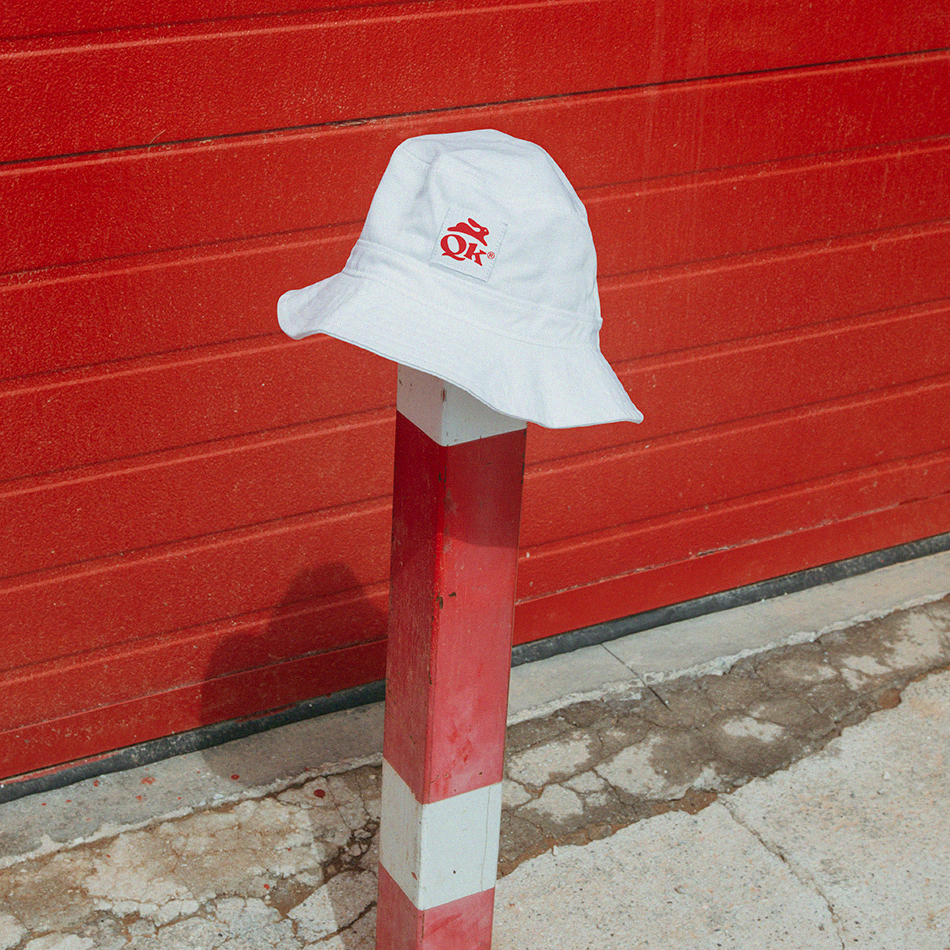
Quick® fast food is a burger joint that emphasizes speed and convenience. The logo design, which is inspired by a running rabbit, reinforces the idea of speed and agility. Rabbits are known for being fast and nimble, and the use of a rabbit in the logo suggests that Quick® fast food is fast, efficient, and always on the go.
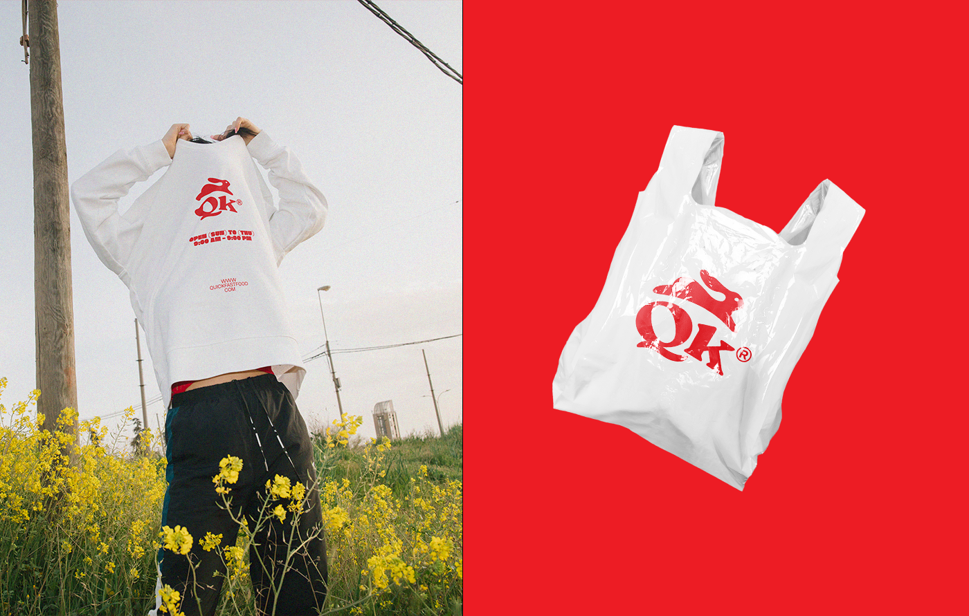
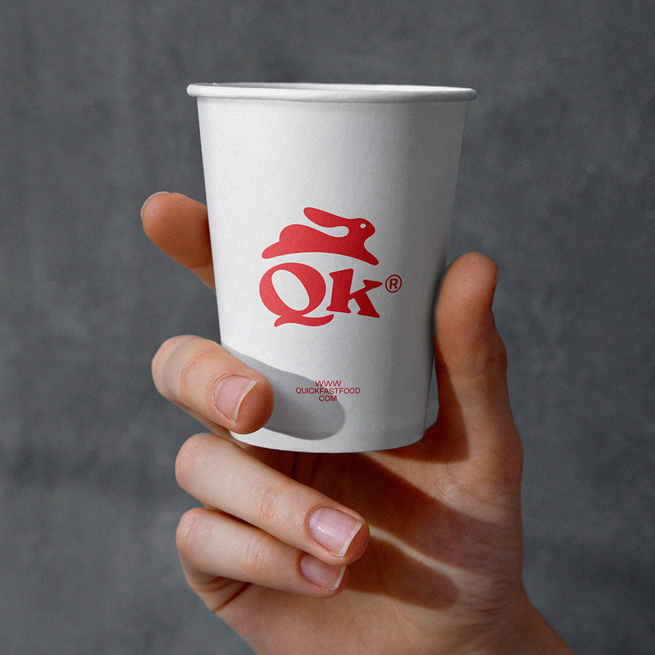
The use of the shortcut "QK" in the logo is a clever way to represent the brand concept. The letters "Q" and "K" are adjacent to each other in the alphabet, which reinforces the idea of speed and quickness. The shortcut also makes the brand name more memorable and easy to recognize.
Overall, the logo design for Quick® fast food is an effective representation of the brand's focus on speed and convenience. The use of a running rabbit and the "QK" shortcut perfectly capture the brand's concept and make it easy for customers to remember and identify.
QUICK FAST FOOD | SA ©2022
SCOPE OF WORK
Brand Strategy, Logo design & full brand Identity development.
© All copyrights reserved


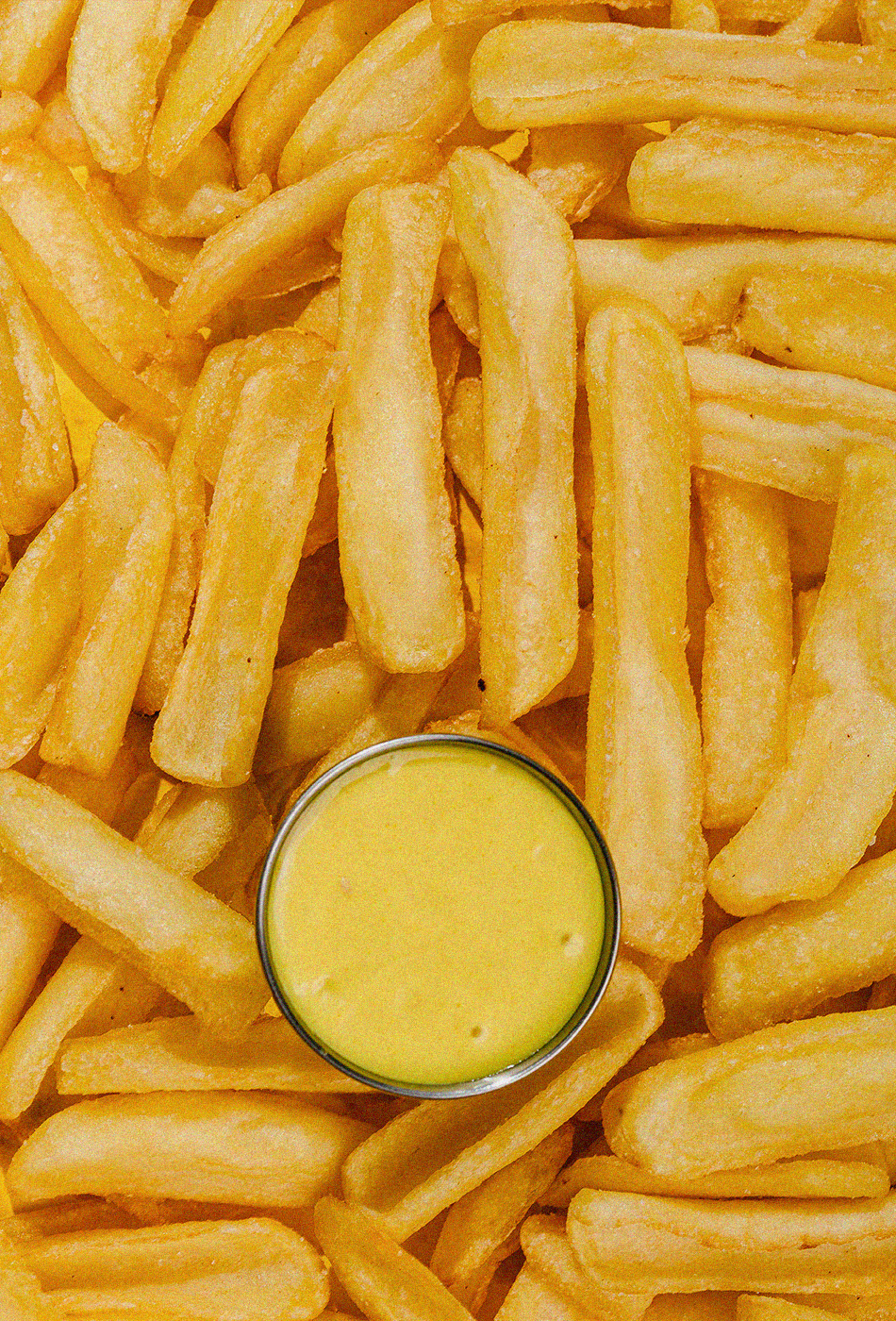
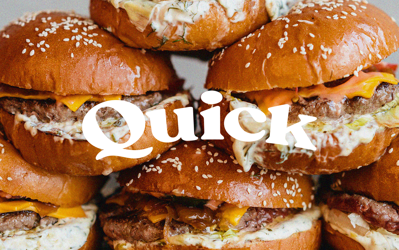
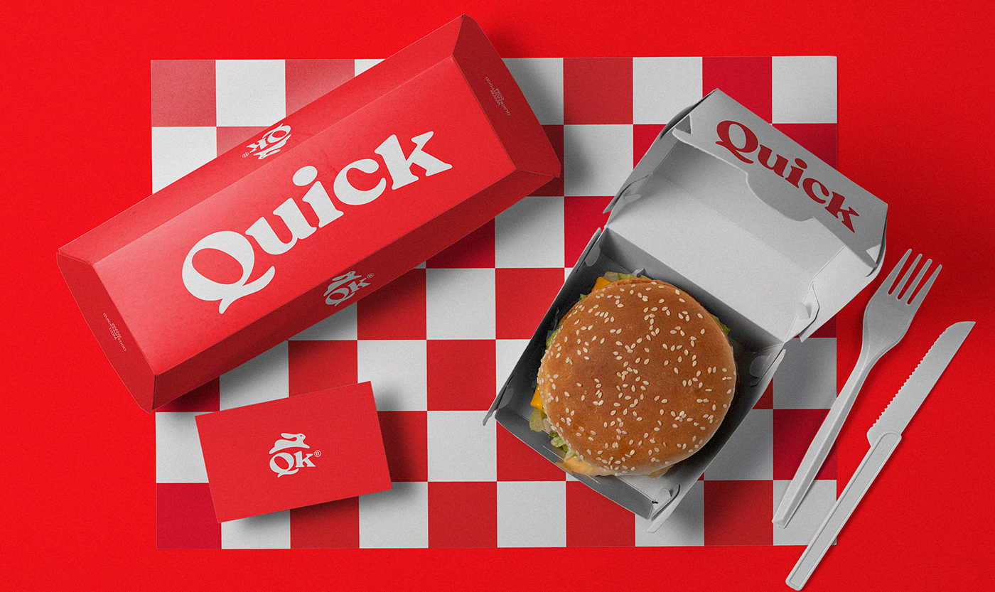
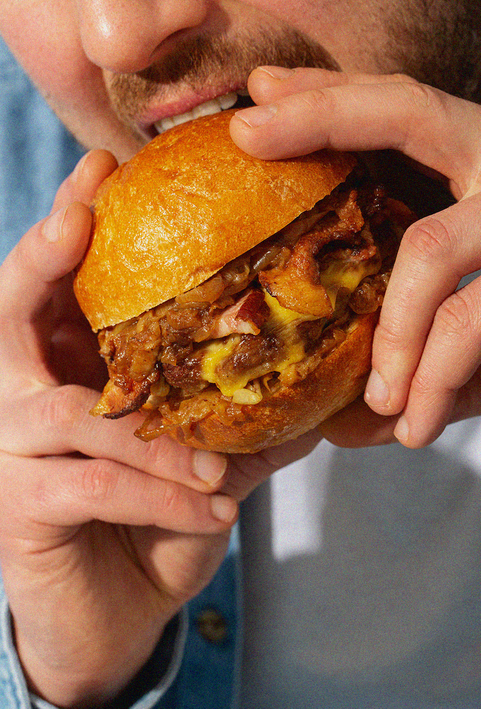
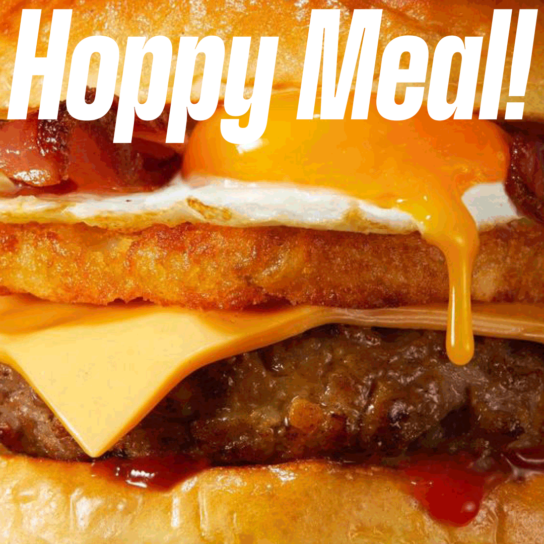
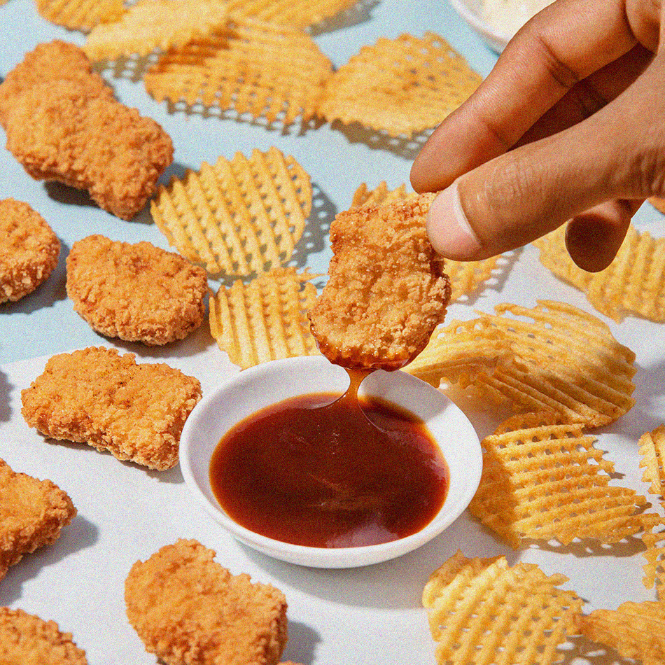
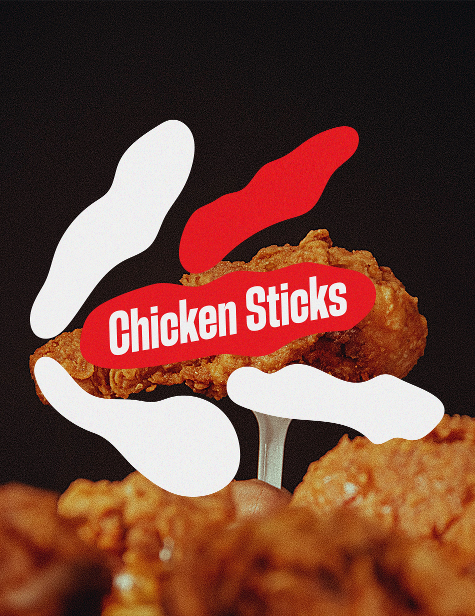
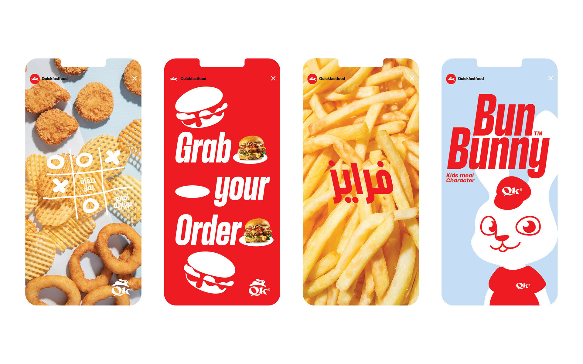
Quick fast food believes that good food shouldn't be complicated. their menu features mouth-watering burgers made fresh daily with only the finest ingredients. Locally sourced, grass-fed beef is their star ingredient. Each burger is cooked to perfection and served on a toasted, buttery bun with your choice of toppings.